12 June 2026
Last edited: 16 July 2026
BlueDot Technical AI Safety Puzzle #1: Our Approach
A few pretty graphs and explanations of what we did to solve the first BlueDot Technical AI Safety Puzzle.
Editor's Note: We came 3rd in the BlueDot Technical AI Safety competition! You can see the other winners on the official website.
Recently, BlueDot Impact put out a Technical AI Safety Puzzle. The goal of this task to understand a simple model which had been trained in a unique way. The BlueDot team trained a simple Multi-layer Perceptron (MLP) head on top of the sentence-transformers/all-MiniLM-L6-v2 sentence embedding model, and trained it to predict whether input sentences had any of 8 classes present. The 8 classes were for: number, question, color, food, sentiment, country, person and body_part. The network was trained such that the post-ReLU activations of the 3rd MLP layer were linearly separable for all but one of the classes. 1
We took a few days to explore the problem and wrap our heads around what the data showed us, before submitting our solution on 3rd June. On 14th June it was confirmed that our submission was correct, which was a nice surprise!
I won't bore you with the full report that we submitted, but here are some of the prettier pictures, what they represent, and what we think they showed.
Task 1: Identify the non-linear feature
A good first step in any linear steering investigation is to take positive and negative samples (e.g. samples that show the behaviour you want to inspect, and samples that don't show it), push them through the network, grab the activations you're interested in, and plot them in 2D (usually using UMAP to reduce the dimensionality). This obviously has limitations, but it's surprisingly effective at finding which features are linearly separable, and where. This figure represents us doing that for each of the 8 features listed above:
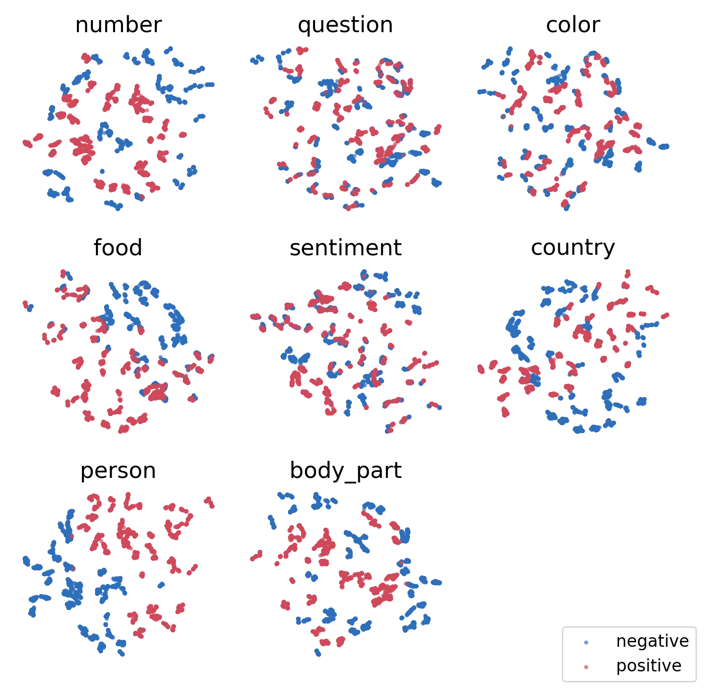
What we were hoping to see from this image is 7 of the features having very clear separability (e.g. blue and red points form 2 distinct clusters), with one feature being all mixed in. But, sadly, they all appear mixed in. We also tried this in 3D, to no avail.
Our conclusion from this then: the classes must be linearly separable in >3 dimensions. Which is a reasonable assumption, but means plotting alone won't get us the answer.
Next step: logistic regression.
We again take our positive and negative samples for each of the 8 features, and instead train a linear model to predict the class from the activations. This should get 100% accuracy if the features are linearly separable, and struggle to get a good fit if they're not. This figure shows the accuracy of our linear classifiers for each of the features:
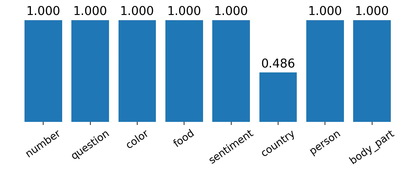
Much better. The odd-one-out is clearly the country feature!
Task 2: Finding how the feature is represented
So, given it's not represented linearly, the next task was to figure out how it was represented. Here are some plots that we did to get to our conclusion:
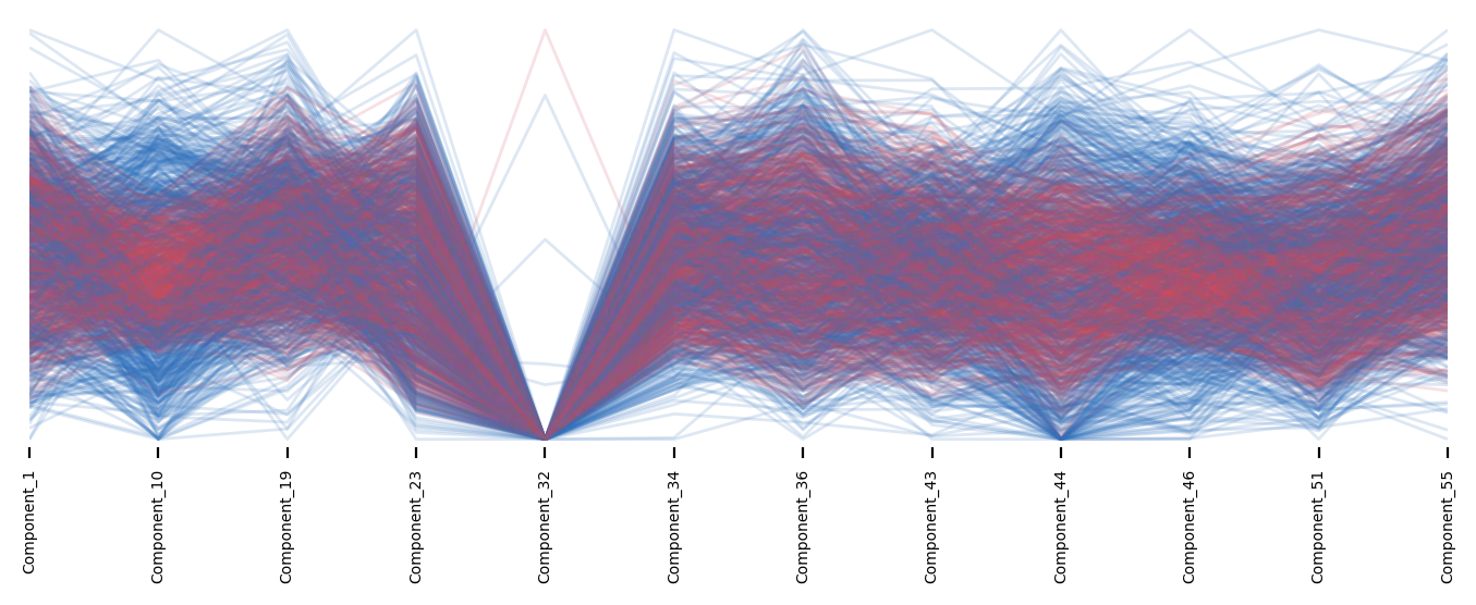
The above figure is a Parallel Coordinates plot of the activations for the country feature. Not a whole lot of structure emerges here.
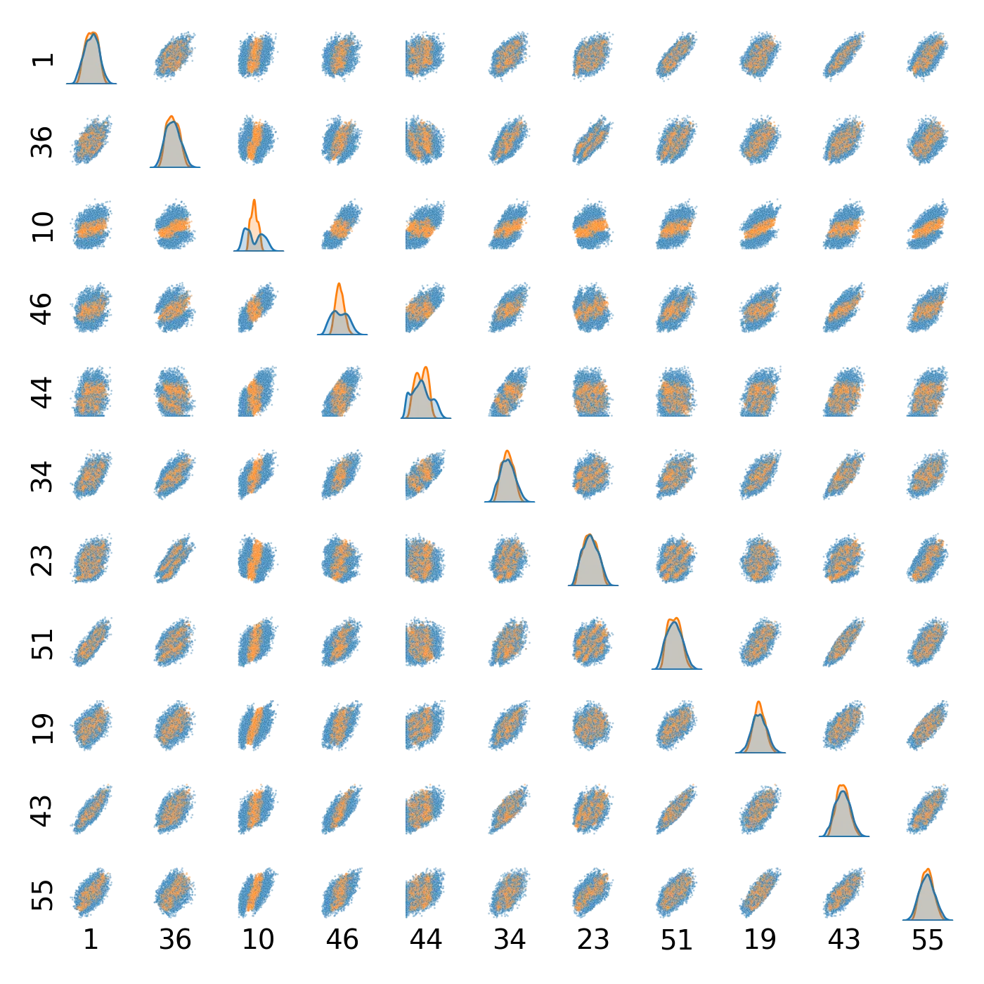
The above figure is a Pairplot of the different activation elements for the country feature. Effectively just every dimension, plotted against every other dimension. The diagonal row shows a Kernel Density Estimate (KDE) of the activations (it wouldn't make sense to plot a dimension against itself, you'd just get a straight line of points) so this instead shows how the data is distrubted, coloured according to whether the sample is positive or negative. Not a whole lot of structure, but some highlights include Components 10 and 46 showing some interesting stuff. Their KDE plots have clear patterns of how orange and blue points are distributed, and the scatter plots for these rows sort of indicates a blob of orange surrounded by blue. Definitely more structure than we've seen in other plots.
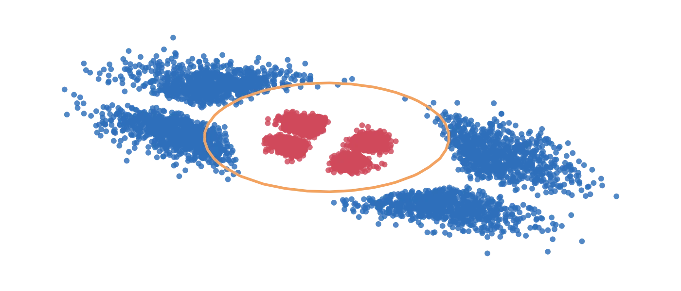
The above figure is the most solid structure we've seen so far. This plot represents the positive (red) and negative (blue) samples in a specific region in activation space. We get to this space by training a quadratic model (rather than linear) on the country samples. Think of this as: rather than separating points with a straight line, we are able to separate them by any line that can be drawn as a quadratic (e.g. anything up to a power of 2 of the constituent dimensions). The orange line represents our decision boundary (e.g. where the model that we trained switches from thinking "This sample has the country feature" to "This sample does not have the country feature). There's a very clear distinction here, which we'd expect given that our quadratic model got 100% accuracy.
What is more interesting is the 4 lobes in both positive and negative regions. This is not an artifact of the plotting, but an actual structure that is in the data.
What does this actually mean? Well, with some more plotting, we were able to determine that the country feature is actually represented as the combination of 2 of the other features:
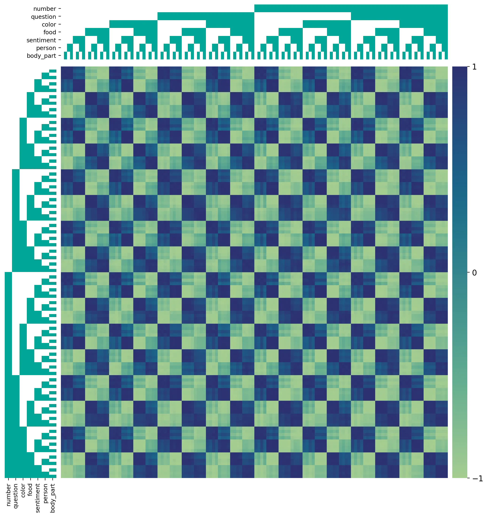
The above figure shows how strong the country feature is, depending on which other features are present. The block diagrams along the left and top sides show which other features are active. The really clear checkerboard pattern lines up exactly with the food feature being enabled/disabled in these block diagrams. And the more suble pattern (another checkerboard within the main checkerboard) lines up exactly with the sentiment feature being enabled/disabled.
So: the country feature is represented by a combination of the food and sentiment features.
We confirm this by looking at just these two directions, and seeing if we can move in a straight line within this space in such a way that we flip from country being negative to positive:
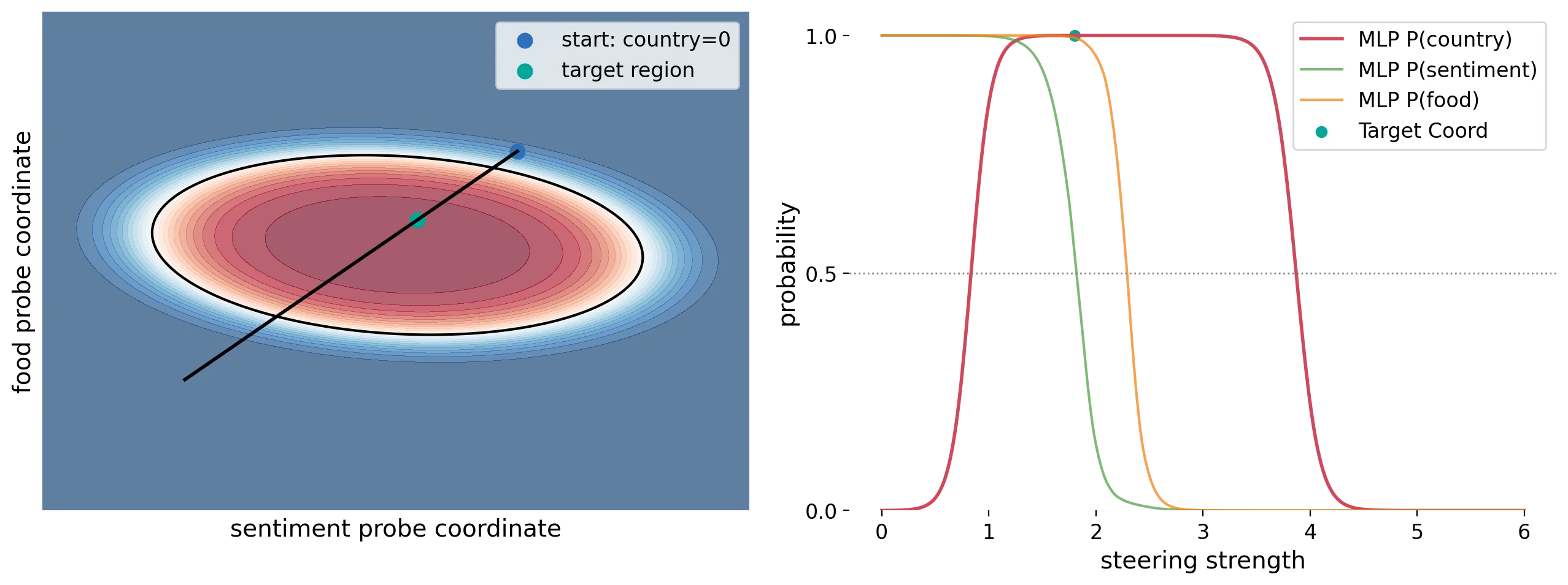
The above figure shows exactly this. On the left, we see the straight line that we take through the space, and confirm that it goes from country being negative to positive, and then back to negative (when we emerge from the other side of the region). On the right, we see the probability of country being positive as we move along this straight line.
What was our answer, then? Our conclusion is:
The linear directions for
foodandsentimentform a basis within activation space, and thecountryfeature is defined by a region within this space (not as a direction). This explains whycountrycannot be linearly separated: thecountryregion is fully surrounded by the non-countryregion, and thus movement from outside to inside thecountryregion cannot be globally defined.
Not the most satisfying answer, but it was confirmed to be correct. What is more interesting, is how exactly the problem setters managed to achieve this (it's fairly non-trivial, and doesn't happen by accident). Poking around with the plots and coming to our conclusion gave us some ideas about how the setters may have done this, which we took into Task 3:
Task 3: Training a "more interesting" representation
The third task was to take what BlueDot had done, and train a "more interesting" representation of a feature, where "more interesting" was in the eye of the beholder. To find out what we did here, read more in the companion blog.
Footnotes
- 1."Activations" here means some internal state of the model, that is usually opaque to the user. These states are essential for how modern LLMs function, and store complex extremely-high-dimensional information as it flows through the network. Recent research, called Mechanistic Interpretability has shown promise in using these hidden states to undertand how a model works and what it is "thinking" as it processes information. The "post-ReLU at the 3rd layer" is simply saying where exactly in the network to look - something that the problem setters told us at the outset.↩